Post Timeline block allows you to choose Custom Post Type and displays them in the timeline. It provides an option to select available post types as posts or pages
Query
Taxonomy: Select Tags or Categories to filter the posts from.
If you select Tags, you will see another option to select the tags whose post you want to display, and if you select category, you will see the Category option to select category whose post you want to display.
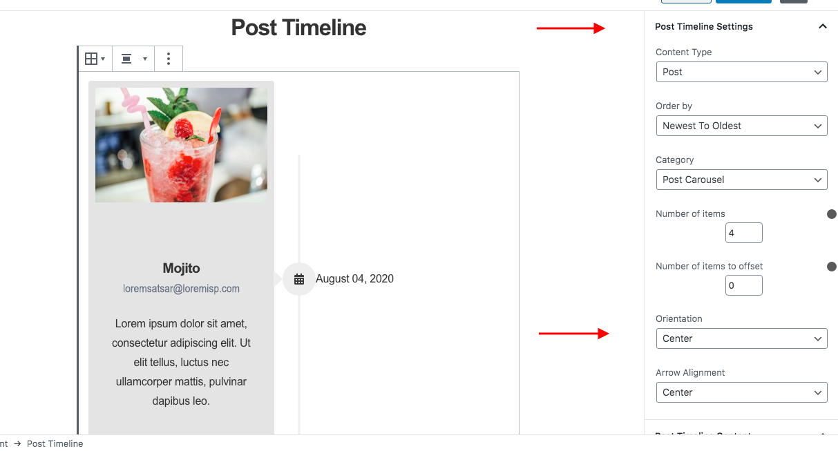
Post Timeline Settings
Under the Post timeline settings tab, Content Type option allows choosing post types – posts or pages.
Order by option allows you to order posts according to date, title, random, or menu order.
Order the posts in ascending or descending order.
Border Radius option is available to set border-radius for posts.
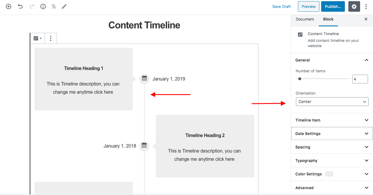
Orientation for the icon and a post timeline can be set to Center, Left, Right from Orientation. Arrow Alignment can be set vertically top, bottom, or center with respect to timeline card.
Post Timeline Content
Display Section Title - Hide or Display a title on top of post timeline. If you choose to display the title, an input box will appear for you to write a title.
Display Featured Image - Hide or Display featured image of post/page if there is one.
Display Title - Hide or Display the title of the post.
Display Author - Hide or Display the name of the author of the post.
Display Date - Hide or Display the published date of the post.
Display Excerpt - Hide or Display the excerpt of the post.
If you choose to display the excerpt, a slider will appear for you to select the excerpt length of the post.
Display Continue Reading Link - Hide or Display a continue reading link for the post. If you choose to display the link, an input box will appear for you to customize continue reading text.
Open link in new tab - Toggle on to open the continue reading link in a new tab.
Post Timeline Markup
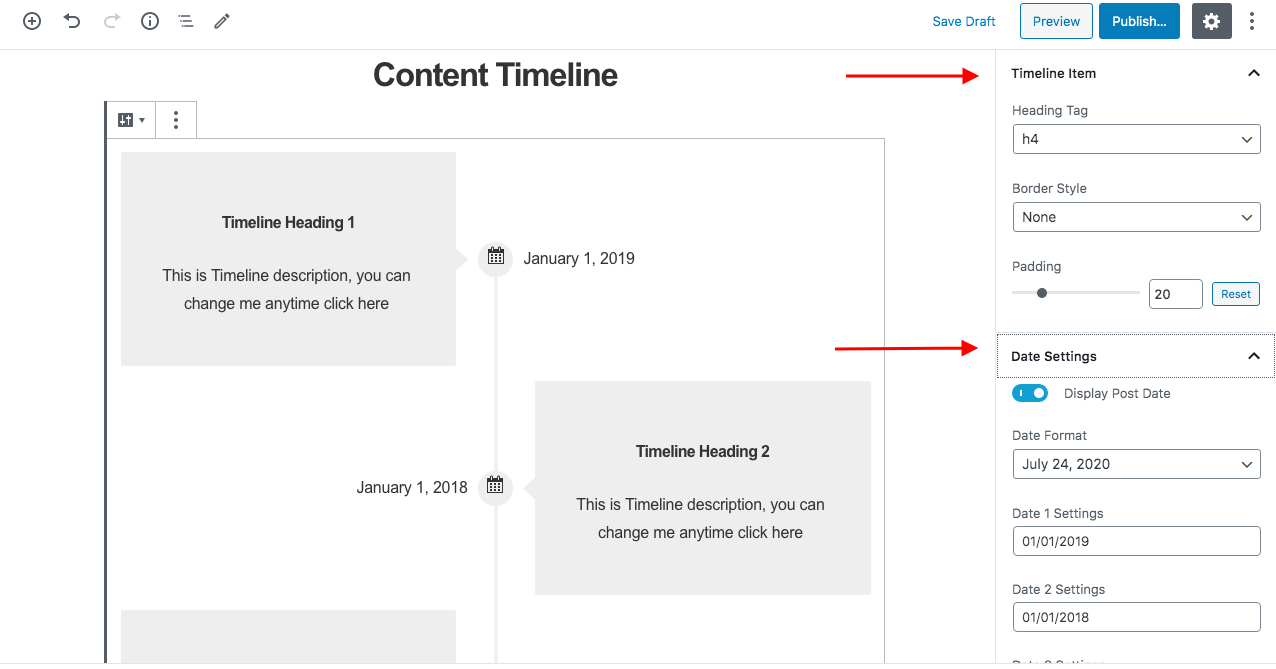
Post Timeline Section Tag - You can select the tag that you want to allot to the grid section such as div, header, section, main, aside, footer.
Post Title Heading tag - You can select the tag that you want to allot to the section title from H2 to H6.
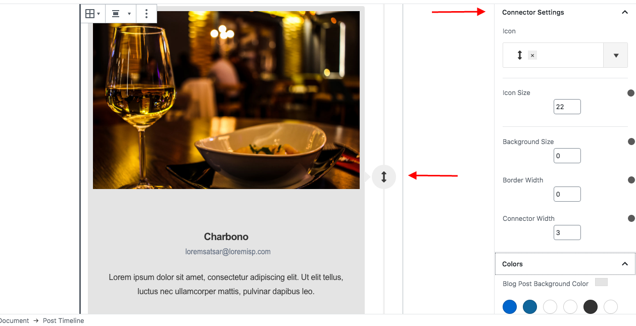
Connector Settings
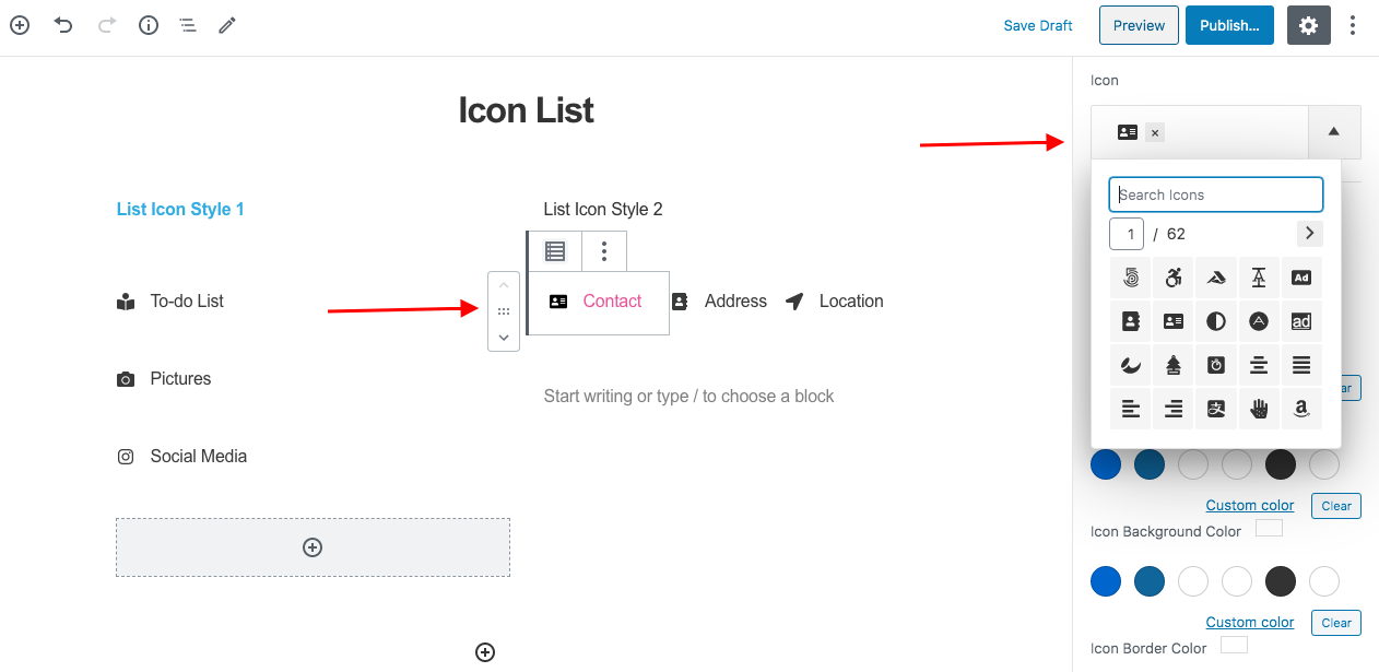
Choose an icon for the connector from a number of options.
Icon Size - Increase or decrease the size of the icon from here.
Border Width - Set a border to the connector element from here.
Connector Width - Set the width of the connector line with this option.
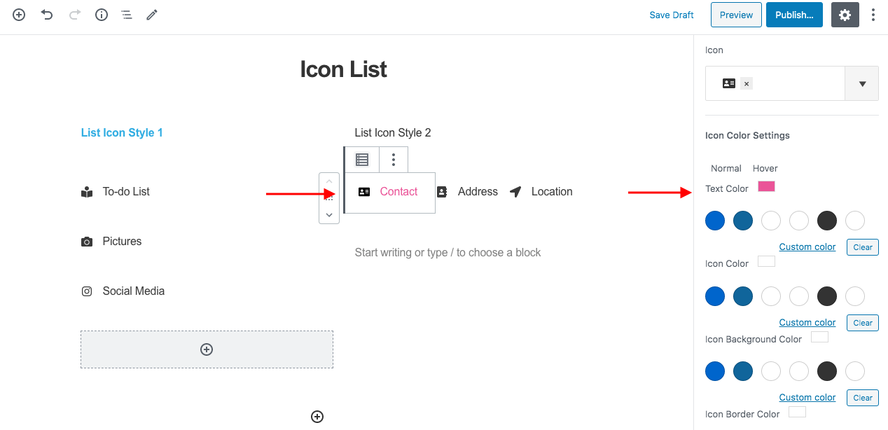
Connector Color Settings - Under the Colors tab, color options are available for Line, Icon, Background, and Border.
Colors
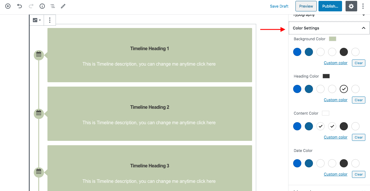
Under the Colors tab, color options are available for Blog Post Background, Heading, Author, Content, Continue Reading Text.
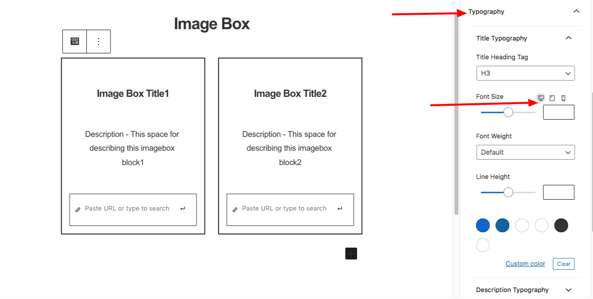
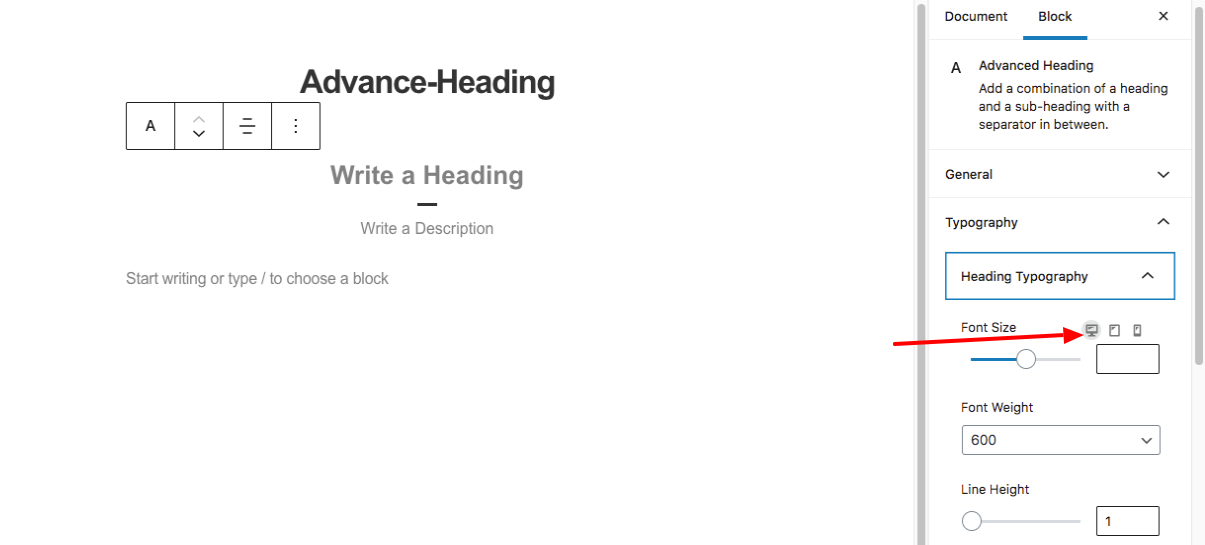
Typography
Under the Typography tab, options for font size, font-weight, color, and line-height are available for Date, Heading, Author, Content, and Continue Reading Text.
Padding
Space can be managed for the content of the timeline card from the Padding tab.
Spacing
Spacing tab offer options to customize the spacing for Block, heading, and author.
Button Box Shadow
You can give box-shadow to the CTA button with a number of options available for customization such as color, blur, spread, position, etc.
